Generating a KI Model to predict my Power consumption at home
I am very new to KI and AI, yes but hey in my last article about identifying the faces in a picture, I tried to optimize the system here at my smart home.
Actually I using a small KI / ML in Azure that takes my consumption calculates the possible consumption in the next two years, and predicts if there is a change to a new provider better and saves me costs (depending on services and so on). For this, I will make an article later this year. For now, I will concentrate on generating the KI model to predict the consumption for the next year.
So I started to search for a good model.
Identify the best model to use
I read about it, and instead of using a new model, I can use an existing one, because I don't think that I am the only one, that wants a prediction like this. Because energy providers are also very interested in for buying energy on the market with minimum risk and so on. So my first try is to use Google to search for a good model. I end up with the SARIMAX model.
What is SARIMAX
SARIMAX is an extension of the ARIMA (AutoRegressive Integrated Moving Average) model. This a model that analyses time series and can do a forecast of upcoming time series. The SAMIAX model extends the Seasonal information (cold winter, hot summer, and so on). And also the X represents the eXogenous variable. This does not directly come from the time series but may still influence it. SARIMAX allows the integration of such external factors into the model to improve forecasting accuracy.
In summary, the SARIMAX model is designed to model both the temporal dependence and seasonal patterns in the data while providing the flexibility to incorporate external factors. So in fact the model is suitable for my trying to predict the power consumption
Train the model
Of course, I learned that KI will use always python because it's powerful. So first of all I loaded all my data into the code. I get the data from my homeassistant smart home system. I exported the data (for training) into a CSV file and loaded it in the python
import pandas as pd

data = pd.read_csv('input.csv')
The content of the CSV file looks like this
Datum,Verbrauch
2022-01-01 00:00:00,14.92905377408739
2022-01-01 01:00:00,15.344728773849258
2022-01-01 02:00:00,14.502509204101026
2022-01-01 03:00:00,14.271073302423396
2022-01-01 04:00:00,14.970628270804868
2022-01-01 05:00:00,15.313465747388726
2022-01-01 06:00:00,15.212827737923645
2022-01-01 07:00:00,15.39688260215628
Sorry for the German words, but in fact one column contains the timestamp and the other column contains the consumption.
Now it's time to split the data into train and test data
    print("NO Model found, using data do generate a new one")
    ## Convert to tdatetime
    data['Datum'] = pd.to_datetime(data['Datum'])

    # Split in Train and Testdata
    train_data, test_data = train_test_split(data, test_size=0.2, random_state=42)
Now it's time to load the model and assign the data to it
from statsmodels.tsa.statespace.sarimax import SARIMAX
from statsmodels.tsa.statespace.sarimax import SARIMAXResults


model = SARIMAX(train_data['Verbrauch'], order=(1, 1, 1), seasonal_order=(1, 1, 1, 12))
This will define that the SARIMAX model will be used and add the consumption (verbrauch) data to it. The order and seasonal_order will describe the data flow and how it will represent the seasonal settings.
Now when you execute it, the script trains the new model. and the output must look like this
RUNNING THE L-BFGS-B CODE
           * * *
Machine precision = 2.220D-16
 N =            5     M =           10
 This problem is unconstrained.

At X0         0 variables are exactly at the bounds
At iterate    0    f=  1.09553D+00    |proj g|=  4.37568D-01
At iterate    5    f=  9.22713D-01    |proj g|=  1.24181D-01
At iterate   10    f=  8.51502D-01    |proj g|=  7.92404D-03
At iterate   15    f=  8.43432D-01    |proj g|=  1.81408D-02
At iterate   20    f=  8.42500D-01    |proj g|=  5.37805D-03
At iterate   25    f=  8.42404D-01    |proj g|=  3.18447D-04
           * * *

Tit   = total number of iterations
Tnf   = total number of function evaluations
Tnint = total number of segments explored during Cauchy searches
Skip  = number of BFGS updates skipped
Nact  = number of active bounds at final generalized Cauchy point
Projg = norm of the final projected gradient
F     = final function value

           * * *
   N    Tit     Tnf  Tnint  Skip  Nact     Projg        F
    5     27     45      1     0     0   1.363D-04   8.424D-01
  F =  0.84240300105255983

CONVERGENCE: REL_REDUCTION_OF_F_<=_FACTR*EPSMCH
NO Model found, using data do generate a new one
This output will provide an overview of the model generation. In common it did an iteration count of 27. So it trains a very long time for now. But I am interested if the model is good enough.
Testing against the test set with the "Mean Squared Error" check
For checking the correctness of the prediction I can compare the prediction with the test dataset. For this, I sum up the difference make an average, and squared it to get a value to check against it.
The result must be the possible lowest one, which means that the prediction will be very good. If the value is high, then you see that the model is far away from a good prediction.
To get the Mean Squared Error I use the following method
    predictions = results.get_forecast(steps=len(test_data))
    predicted_mean = predictions.predicted_mean
    # Evaluate the model (eg. Mean Squared Error)
    mse = ((predicted_mean - test_data['Verbrauch']) ** 2).mean()
    print(f'Mean Squared Error: {mse}')
In my example with the dataset, it results in this line
Mean Squared Error: 0.35250814348458676So it's very low, near 0. Thats good! Very good indeed 😄.
Keep in mind, that you cannot reach the value 0, but the target is to get the lowest value. But it depends on the domain. So when you try to predict the temperature for the future a value of 5 can be good enough. But for example when you predict a stock price for tomorrow, a value of 5 is not a very got result.
Do the first prediction
So now we have a trained model and we checked the results against the test set. Now it's time to get some predictions, and let the "magic" work 😄.
So at first, I will predict a time range of 14 days from the maximum date value (in the dataset).
forecast_steps = 14
future_dates = pd.date_range(start=data['Datum'].max(), periods=forecast_steps + 1, freq='d')[1:]
This will get me an array of 14 days. Next, I will "throw" it into my model and tell it that he should predict the data for it
forecast = model.get_forecast(steps=forecast_steps)
forecast_mean = forecast.predicted_mean
print("predictions:")
print(forecast.predicted_mean)
The results of the forecast call will contain the predicted values and iw till generate the output like this
predictions:
3456    14.759803
3457    14.862023
3458    14.895377
3459    14.803441
3460    14.817742
so it's near to the input values. that cool. But let's do some more. I want to display the existing data and the predicted one
Displaying the data aka plotting
In Python it's very simple to "plot" the data into an image
In our example, I use the following lines of code
plt.figure(figsize=(12, 6))

# original values
plt.plot(data['Datum'], data['Verbrauch'], label='measured values', color='blue',linestyle = 'solid')

# values
plt.plot(future_dates, forecast_mean, label='forecasts', color='red',linestyle = 'solid')

# Fill in with forecast values
#plt.fill_between(future_dates, forecast.conf_float()['lower Verbrauch'], forecast.conf_float()['upper Verbrauch'], color='red', alpha=0.2)

plt.title('Power consumption')
plt.xlabel('Date')
plt.ylabel('consumption')
plt.legend()
plt.savefig("prediction.png")
Now I get the following output
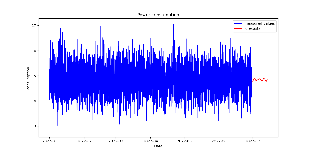
The blue ones represent the existing measured data and the right ones are the predictions (on average). When I look at both sides I see the average line comply to the blue trend. So I think the prediction will help me to identify the consumption in the future. But I want to have not only the average values, but I will also display the upper and lower boundaries to identify the range in which the prediction was made for this I uncomment a single line from above and the code looks then like this
plt.figure(figsize=(12, 6))

# original values
plt.plot(data['Datum'], data['Verbrauch'], label='measured values', color='blue',linestyle = 'solid')

# values
plt.plot(future_dates, forecast_mean, label='forecasts', color='red',linestyle = 'solid')

# Fill in with forecast values
plt.fill_between(future_dates, forecast.conf_float()['lower Verbrauch'], forecast.conf_float()['upper Verbrauch'], color='red', alpha=0.2)

plt.title('Power consumption')
plt.xlabel('Date')
plt.ylabel('consumption')
plt.legend()
plt.savefig("prediction.png")
This will now plot the graph and add the boundings as red shade too. The result looks now like this
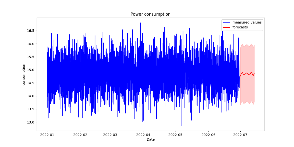
You see yourself, that the upper and lower values are not far away from the existing ones. So I think the model was perfect for me and I can now use this model that will predict me more than 14 days. For example, I can now use more time like 2 years. But I think that here my dataset has too few elements in it because it contains only one year not more. So think that this year represents the complete other years and ignores seasonal extreme values like hot summers in which we let run our climate longer than usual. So the prediction will be affected by the source data.
Train the model again
One more information about this model. Once it is trained, you cannot use the model again and enrich it with more train data. So you must every time regenerate the model with the new data. In my case, I use the model for one month and when the month is over, it will be regenerated with all fresh data and the existing old ones. I do this as a cron job on my homeassistant server
Conclusion
You see, using a model to train it with your custom data, is quite easy. However the results depend on the input data. In my example, it was very easy, so the outcome can be easy ly predicted in some time, but I must be aware of this. So I retrain the model every month completely. In fact, the new data cannot be assigned to train it more.